What Is a Retail Store Layout?
A retail store layout (whether physical or digital) is the strategic use of space to influence the customer experience. How customers interact with your merchandise affects their purchase behavior. This retail principle is one of the many from Paco Underhill, author of Why We Buy: The Science of Shopping, keynote speaker, and founder of Envirosell.
The interior retail store layout has two important components:
- Store Design: The use of strategic floor plans and space management, including furniture, displays, fixtures, lighting, and signage. Website designers and user experience (UX) researchers use space management techniques and web design principles to optimize e-commerce websites. We’ll further discuss a variety of popular retail floor plans later in this article.
- Customer Flow: This is the pattern of behavior and way that a customer navigates through a store. Understanding customer flow and the common patterns that emerge when customers interact with merchandise based on the store layout is critical to retail management strategy. Physical retailers are able to track this using analytics software and data from in-store video and the wifi signal from smartphones. For example, solution providers like RetailNext provide shopper analytics software for retailers to understand flow and optimize the customer experience based on in-store video recordings. The technology also exists to track the digital customer flow and online shopping behavior. Using “cookies” and other software, online retailers can track customer behavior, including how customers interact with their website.
While the exterior retail store layout includes exterior store design and customer flow, it also includes the following factors:
- Geographic location of the retail store (real estate)
- Size of the building and length of the walkways accessible from the entrance and exit
- Use of furniture and exterior space for people to gather and interact
- Style of architecture of the retail building
- Color of paint and choice of exterior building materials
- Design of the physical entrance and exterior window displays
The objective of retail store design is to positively impact customer experience and create value, which is the primary goal of retailers in the supply chain. For more information on retail strategy and management read the article “How to Survive and Thrive in Retail Management.”
What Is Store Planning?
Store planning is the designing and optimizing of physical retail stores to upgrade customer experience and maximize sales. It involves determining the ideal store size, layout, fixture placement, signage, and product placement to create a visually appealing and engaging shopping environment.
A Step-By-Step Guide to Planning Store Layouts that Maximize Your Space
It is essential to understand your customer flow and the general patterns of navigation in your specific retail environment before you can optimize customer experience and plan a strategic store layout. Retailers, consultants, store planners, interior designers, and architects all use a variety of retail floor plans and concepts to influence customer flow and behavior. Retail giants along with small, independent retailers can improve customer experience, and in return, long-term profitability with efficient store layouts. In Store Design and Visual Merchandising: Creating Store Space That Encourages Buying, author Claus Ebster offers valuable insight into maximizing your retail space.
Step One: Target The First Floor
The first step to maximize your profitable retail space might be the most unavoidable, however the principle and knowledge behind the customer behavior is crucial for understanding your overall design strategy. Ebster’s research indicates that customers prefer to navigate the floor of a retail store they initially entered. Walking up and down stairs or using elevators and escalators to navigate a store hurts customer flow. When possible, planning for a single floor store design will optimize the customer experience. Exceptions exist, such as downtown locations where real estate is at a premium or large department stores with multiple categories of merchandise. Further, Ebster points out that retailers should consider customer perception if they are a luxury retailer, as shoppers often associate multi-level stores as “elite.” Conversely, if a discount retailer is planning store layouts, as customers associate single floor layouts with “less high-end” merchandise. Consider your overall retail strategy and store layout design prior to selecting your store location. If you have multiple floors, account for the preferences of first floor shoppers by using this space for the feature or high-margin merchandise in your retail mix.
Step Two: Identify Customer Flow
Ebster presents some general rules for customer traffic. Customer flow patterns vary depending on the type of retailer, the size of the store, and the target customer. Ebster encourages retailers to use their observations to discover the problems and opportunities unique to their environment. The next step in maximizing your space for profitability is identifying your customer flow. The most effective method for understanding your existing customer flow and identifying areas of opportunity is video recording and heat mapping analysis. This service is available via solution providers such as Prism (you can also do a quick online search for heat mapping consultant services in your area). However, setting aside different times of the day to make in-store observations in person and recording your notes is a step in the right direction for identifying customer flow patterns.
Step Three: Avoid The Transition Zone
After you identify how your customers navigate your entire retail space, turn your attention back to the entrance. The transition zone area, coined the “decompression zone” by Underhill, refers to the space just beyond the entrance to a retail store. The average customer needs this space to transition so they can familiarize with the new environment. Underhill is adamant that nothing of value to the retailer, not high-margin merchandise, prominent signage, or brand information goes inside this zone. Customers need time, however brief, to adjust to new lighting, smells, the music, and the visual stimulation in the store.
Step Four: Design for Clockwork Navigation
The next step moves beyond the transition zone and shifts the focus on how to leverage a customer’s tendency to navigate the retail environment. The area just outside of the transition zone is where most retailers make a first impression. Customers consistently turn right after entering the store and continue to navigate the store in a counterclockwise direction. Ebster points out that this customer behavior repeats itself time and again in consumer research. Although researchers and design professionals have different explanations for the reaction, in general, many recommend displaying high-margin merchandise and valuable information just to the right of the entrance (outside of the transition zone). Underhill popularized the “invariant right” and proved the effectiveness of the technique with thousands of hours of video.
Step Five: Remove Narrow Aisles
Finally, follow your customer flow through the transition zone and around the retail space in a counterclockwise pattern. Search for tight spaces or bottlenecks along aisles or around fixtures and displays. Repeated analysis of Underhill’s video research demonstrates that customers in the US — women in particular — value their personal space when shopping. If a customer is touched, bumped, or otherwise interrupted when interacting with merchandise, they are likely to move on from the items or exit the store altogether. Ebster uses customer behavior research from one study of a supermarket to further advocate for broader aisle design. Video analysis showed fewer customers entering narrow aisles in the store compared to the more expansive, accessible walkways. These aisles send positive signals to shoppers and positively impact customer flow and merchandise interaction. Avoid narrow aisles and corridors when planning your store layout and strive to protect customers from what Underhill coined as the “butt-brush effect.”
Essential Retail Store Layouts
Once you research and understand how customers navigate your store, you can start influencing how they interact with the merchandise. The foundation for this strategy is the design of your store floor plan. To create an environment that strategically emphasizes the desired purchasing behavior, it is essential to use all of the floor space you have allotted for merchandise, base your layout on the principles of customer behavior, and not sacrifice customer flow for artistic taste. With these factors in mind, the following are common store layouts for your consideration.
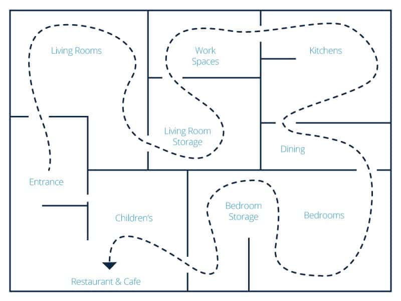
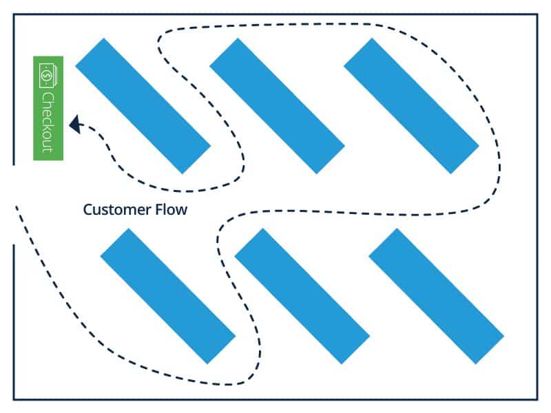
Forced-Path Store Layout
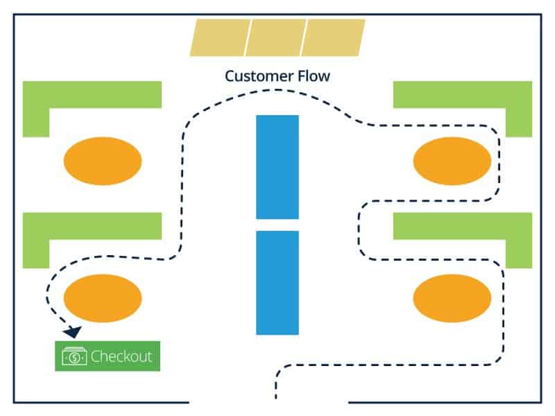
This layout directs the customer on a predetermined route through the retail store. As an example, Ebster uses furniture retailer IKEA to demonstrate the use of the forced-path store design. Research shows that, with this type of store layout, IKEA achieves a uniform and efficient customer flow that promotes higher sales.
Ebster discusses the advantage of a forced-path layout: Every aisle in the store is maximized. With customers exposed to all of the merchandise offered, this design might entice the customer to make an unplanned purchase. However, he points out that using this store layout risks irritating shoppers that have a specific task and desired location, and could also overwhelm shoppers by hurrying them through an experience of customers all moving in one direction together, quickly.
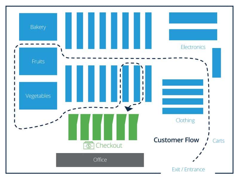
Grid Store Layout
The grid store layout design is a familiar, repetitive pattern favored by retail drugstores like Walgreens and hardware stores like Ace Hardware. According to Ebster, there are multiple advantages to the grid layout, including the following:
- Customers can move quickly through an efficient floor space using standard fixtures and displays.
- The presentation is uniform and comfortable due to its popularity, creating a seamless customer experience.
- Design simplifies inventory control for the retailer - a key to retail strategy that leverages store design to maximize profitability.
However, the downside of this layout is the lack of aesthetics and the “sterile and uninspiring” environment often associated with its use. To counter this, Ebster recommends effective signage to guide customers and create a “cognitive map” of the store.
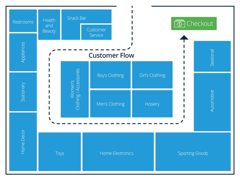
Loop Store Layout
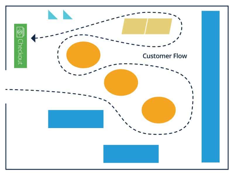
Also known as the “racetrack” layout, think of the loop design as the “yellow brick road” of retail store layouts. Ebster uses this analogy to describe the way a loop store layout uses a path to lead customers from the entrance of the store to the checkout area. This is a versatile choice for store design when implemented with another layout style or used as a prominent feature of the retail store. Ebster recommends this layout for a larger retail space (over 5,000 square feet) and encourages a clear and visible loop for customer flow.
Designers accomplish the loop effect by making the floor path a standout color, lighting the loop to guide the customer, or using a different floor material to mark the loop. Lines are not recommended, as they can be a psychological barrier to some customers, potentially discouraging them from stepping away from the loop and interacting with merchandise. Ebster encourages a loop design that rewards the customer with interesting visual displays and focal points on the way to the checkout area.
Straight Store Layout
The straight store layout is efficient, simple to plan, and capable of creating individual spaces for the customer. Plus, a basic straight design helps pull customers towards featured merchandise in the back of the store. Merchandise displays and signage is used to keep customers moving and interested.
Liquor stores, convenience stores, and small markets use the straight design efficiently. However, the drawback is the simplicity: Depending on how a customer enters the store and moves past the transition zone, it may be more difficult to highlight merchandise or draw them to a specific location.
Diagonal Store Layout
Just as the name implies, the diagonal store layout uses aisles placed at angles to increase customer sightlines and expose new merchandise as customers navigate through the space. A variation of the grid layout, the design helps guide customers to the checkout area. Small stores can benefit from this space management option, and it is excellent for self-service retailers because it invites more movement and better customer circulation.
When the checkout is located in the center and possibly raised up, the diagonal layout offers better security and loss prevention due to the extra sightline effect. The downside of this layout is that it doesn’t enable the customer to shortcut toward specific merchandise, and the risk of narrow aisles is higher.
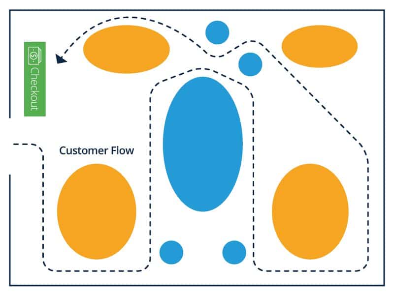
Angular Store Layout
The name of this design is deceptive, as the “angular” store layout relies on curved walls and corners, rounded merchandise displays, and other curved fixtures to manage the customer flow. Luxury stores use this layout effectively because, according to Herb Sorenson’s research from Inside the Mind of the Shopper: The Science of Retailing, customers notice free-standing product displays 100 percent of the time (end cap displays - those at the end of aisles - also get noticed 100 percent of the time).
There is a perception of higher quality merchandise that the angular layout leverages to target the appropriate customer behavior in that environment. And although this design sacrifices efficient space use, because of the rounded displays and limited shelf space, if a retailer has sufficient inventory storage away from the sales floor, this layout is useful in creating a unique perception.
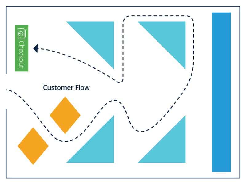
Geometric Store Layout
Popular with retailers targeting trendy millennials and Generation Z demographics, a geometric layout offers artistic expression and function when combined with the appropriate displays and fixtures. The unique architecture of some retail stores, including wall angles, support columns, and different ceiling styles mix well with the uniqueness of a geometric layout.
Merchandise displays and fixtures of various geometric shapes and sizes combine to make a statement, often as an extension of the retailer's overall brand identity. Clothing and apparel stores use a variety of environmental merchandising strategies (for example, music, scents, and artwork) with the geometric layout to enhance the customer experience.
Mixed Store Layout
The mixed store layout uses design elements from multiple layouts to create a flexible option for retailers. Department stores use a compelling mix of straight, diagonal, and angular concepts, among other design elements, to create a dynamic flow through a range of departments featuring a variety of merchandise.
Large grocery store chains also successfully combine mixed store layout elements. For example, customers have the flexibility to navigate through a grid layout for their basic groceries but feel compelled to search the angular displays featuring high-margin wine, beer, and imported cheeses. The advantages of combining different store layouts seems apparent, but the space and resource requirements to maintain this design can pose difficulties to retailers.
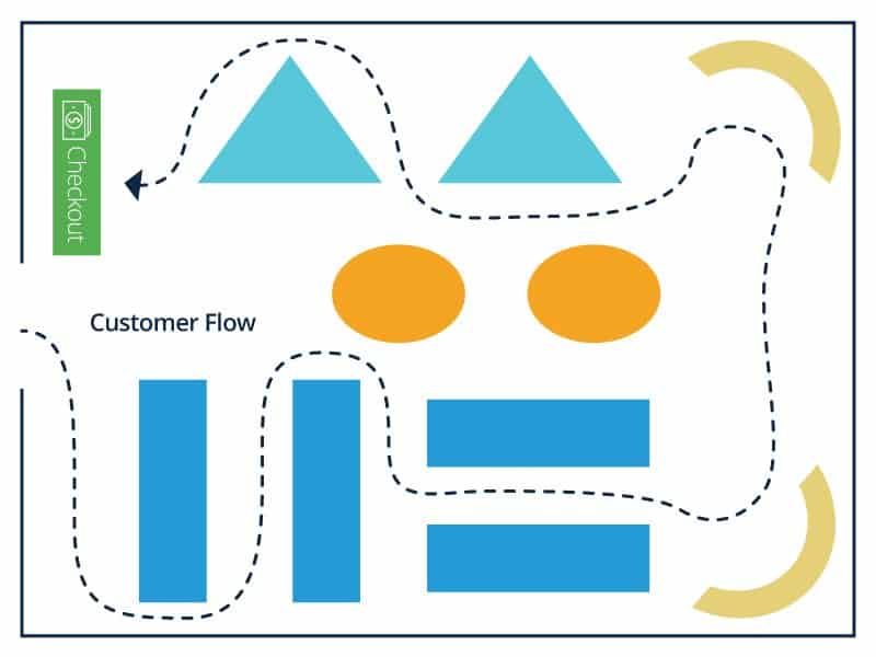
What Is a Free Flow Store Layout?
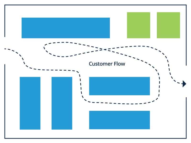
A free flow layout rejects typical design patterns and styles commonly used to influence customer behavior. In a free flow layout, the intent is not to lead the customer using predictable design patterns, displays, or signage. There are no specific design rules followed for this retail store design, and customers have more liberty to interact with merchandise and navigate on their own. For this reason, the free flow layout is sophisticated in its simplicity.
Ebster points out that customers feel less rushed in this creative environment. Retail stores look less sterile in the free flow design, and merchandise may seem more intriguing. The only limitation for retailers using this layout is the overall space available, but that doesn’t mean that the research on customer navigation behavior and tendencies shouldn’t be accounted for as well. The main disadvantage to this experimental design layout is the risk of confusing customers past the point of their preferred behavior and disrupting customer flow.
What Is a Boutique Store Layout?
According to Ebster, the boutique layout (also called shop-in-the-shop or alcove layout) is
the most widely used type of free flow layout. Merchandise is separated by category, and customers are encouraged to interact more intimately with like items in semi-separate areas created by walls, merchandise displays, and fixtures. Typically used by boutique clothing retailers, wine merchants, and gourmet markets, this layout stimulates customer curiosity in different brands or themes of merchandise within the overall category.
- The downsides of the boutique layout include the following factors:
- Reducing the total display space for merchandise with inefficient space management
- Encouraging too much exploration of separate areas within the store
- Confusing customers past the point of purchasing behavior.
Ultimately, the exploration can distract from customer interaction with the merchandise.
Retail Store Design Tips From The Pros
“It is everything! The look, feel, and sounds evoke feelings in consumers and the more it resonates, engages, comforts, or surprises them, the more likely they are to purchase or become a fan, which leads to [more] fans,” says Rodriguez. “If [the design] is too loud, has obstructed or confusing pathways, which some retailers use as a sales tactic, no rhyme or reason [...], it is not conducive to customers spending more time [in store] or converting sales.”
A store’s layout design is not an isolated advantage for retailers. Rodriguez points out that the customer experience is influenced by more than the overall layout. “It’s a mix of thoughtful moments — placement of product stories and unassisted digital experiences throughout the [store] footprint — mixed with sales people that help consumers make decisions quickly and effectively.”
“I think alongside [customer] flow is understanding the sales data to help better inform where you want to [attract] the customer and what the overall experience is from the front to the back of the store,” says Rodriguez. “For a store footprint [design] within a mall, a commercial shopping area, or [inside] a third party retailer (for example Best Buy or Target), understanding the key players around your area and their sales tactics should be a priority. Many companies make the mistake of copying what others are doing, which creates more confusion. People have brand loyalty and want to see differentiation and a reason to move from their comfort zone.”
“Best Buy does this well,” says Rodriguez. “They do a great job with a mix of digital innovations, retail pros and the Geek Squad. They can entice the customer via emails, push alerts via their app, digital experiences throughout the store, assisted and unassisted sales, and tech help to ensure your product is ready to use or installed properly. Basically, they cover all the bases from start to finish and while they don’t always hit the mark, they are open to innovation and trying and measuring new ways to reach the customer base and beyond.”
Rodriguez does not agree with all of the store layout design and “storytelling” that Best Buy uses throughout some of their locations. For example, she believes the video game section could be designed to be more cohesive and less scattered in different spaces.
Authenticity Creates Real Customer Experiences
When it comes to designing the retail store and customer experience, Rodriguez has a specific message. “Be authentic and real,” she says. “Create memorable moments to build and keep fans.”
“So many companies are obsessed with going viral, ROI (which is important), and creating something they think is cool, that they forget why they are doing it. Building fans and purveyors of quality takes time and not every campaign or interactive experience you install will hit the mark,” adds Rodriguez.
“Sometimes it hits the mark but the reaction is delayed. There is no way to measure whether someone saw a great campaign or experienced a digital innovation you created and if that led them to buy months down the road. But the reality is those authentic and real moments stick with people and it takes time [...] The focus should be continuing to be authentic and real — negotiating and editing with successes and failures, but never wavering on those two things.”
Rodriguez points to Nordstrom and Tesla as examples of retailers that understand the importance of authentic, real customer experiences that are easy and memorable.
“Retailers should remember that not every product or outcome is tangible,” shes says. “Interactive experiences at Tesla showrooms in malls allow consumers, who would otherwise not be able to afford the car or wouldn’t go out of their way to visit a dealership, to build and interact [with a virtual vehicle]. They provide a boutique experience which draws in consumers based on emotion, feelings of nostalgia, and even sex. It puts something out of reach directly into their hands.”
Rodriguez appreciates how Nordstrom varies store design elements and floor plan layouts for different customers and how important balanced design is to the customer experience. “They aren’t afraid to experiment and try new things to see how it affects their broad range of target markets,” she says. “Nordstrom understands the importance of providing varying experiences for many types of consumers, creating pop-ups that change out quarterly (sometimes more frequently), curb-side service, personal shoppers, and even a bar just beyond the most shopped area to loosen up shoppers’ inhibitions and their wallets.”
Data Drives Design
To know your customer is to know your retail business. The correlation between a retailer's profitability and the customer experience is closer than ever in retail history. For physical retail stores, this experience is connected to the customer’s surroundings — how they navigate the store’s environment, and the flow of attention they spend on your merchandise and messaging.
The digital, online retail experience follows a similar principle. The design of a website or mobile application, and the user experience the layout creates, is critical to creating value for a customer and in return, has a positive impact on the retailer’s profitability.
For Rodriguez, data emphasizes the importance of design in the overall customer experience and is a core part of any successful retail design playbook. “Data is essential to creating a memorable and effective experience,” she says. “For online experiences, there must be a mix of testing and best practices.”
According to Rodriguez, at Microsoft the data collected from customers interacting with digital screens might include the following:
- Tracking time spent in experience
- Hot spots (how the customer interacts with the device’s screen)
- Click Through Rates (CTRs)
- Impact to sales (ROI)
- Analysis of other sales/promos during that time to influence
Rodriguez further explains that once data is collected and analyzed and an update is needed, it should happen quickly. If the tests are successful, the formula should be documented and repeated. Using data to design and plan physical or digital retail layouts with the overall experience in mind creates value for customers.
“Retailers should not make assumptions about their clientele or only make decisions based on their personal experiences, wants, and needs,” says Rodriguez. She adds a reminder to retailers about the importance of aligning the desired experience of the target customer with retail management and the overall retail strategy. She recommends looking to market research and customer data to make the most impact, remembering that executive leadership, for example, may have a store design strategy that data shows is not aligned with the target customer experience.
“People want their experience to be individualized. [Customers] have become fickle and often are annoyed by an overabundance of help, even if they need it,” she adds. “Algorithms and data are scary to most consumers, but when they realize how it can help to filter and tailor their experience to exactly what they need and want, even before they know they need or want it, the retailer then becomes priceless.”
The Multi-Channel Mindset
Connecting the customer experience with a mobile friendly retail strategy is important, as people are increasingly dependent on their mobile devices and interacting with the digital world throughout the day. Retail customers use their mobile devices to stay connected throughout their shopping experience. This might include checking prices and inventory availability, or using their device to find physical store location and hours.
“As a mobile-first world, we sometimes must forgo the shiny experiences and provide a user with a friendly, value proposition-focused customer journey with fewer clicks to get consumers where they need to be,” says Rodriguez. Part of a sound mobile-first retail design strategy, when considering your ecommerce site or mobile application, is simplicity. Mobile design strategy means impacting the customer experience by making shopping easier.
“From an online perspective, the customer journey should be straightforward, user friendly, and require as few clicks as possible to get the customer where they want to go,” says Rodriguez. “Many consumers stick with what they know until they see the value. Often, this is due to habit or lack of energy to create a new account, enter information, etc.”
Rodriguez believes that the more a retailer does to simplify purchasing, the more value they add to the customer experience. She uses Amazon’s strategy for linking new services and products based on the customer’s purchasing habits as an example of the “ease of purchase” experience retailers should strive for.
“Amazon Go and Amazon.com provide ease of shopping at your fingertips without the hardship of dealing with, well, anyone,” says Rodriguez. “This footprint is a great example of how to bring a digital experience into a brick and mortar reality. While they continue to test, their key to success is measuring, monitoring, and reacting quickly to individual consumer needs.”
Mobile applications provide an opportunity for retailers looking to make purchasing simple and easy, whether the customer chooses the brick-and-mortar or digital shopper journey. “Stores with robust mobile apps can add on everything from triggering [...] a mobile push alert when [the customer’s] within a certain distance from a store location,” says Rodriguez. This alert might notify customers of an in-store event or send a specific deal on seasonal merchandise based on the geo-location of the customer.
“Retailers willing to push the limits of their applications (and spend development dollars) can also use apps to track [in-store] customers and remind [them] of sales or products currently in their cart, request service on the floor with their mobile device, or forgo any interaction with sales reps by ordering everything on their device via scanning barcodes or shopping available stock to have it ready for them at the register,” she adds.
Video Is a Game Changer
Using video to enhance the digital experience and create customer interaction is a game changer. “Video is key,” says Rodriguez. “Studies show that video on home or product pages have conversion rates between 80-100 percent.” Rodriguez recommends using video in “short, snackable bites.” In addition to online advertising and store branding opportunities on social media platforms like Facebook and Snapchat, the reduced cost of digital displays and user friendly digital video tools provides retailers with creative, affordable ways to design their stores to leverage video. A couple examples of leveraging interactive video display include the following:
- Touchscreens: Customers spend an increasing amount of their day interacting with their mobile devices and retailers can leverage this habitual behavior. “Consumers will try to interact with any type of screen out of habit,” says Rodriguez. “This is an opportunity to quickly educate consumers, update content remotely, compare products, and share ratings, reviews, or tech specs.” Rodriguez claims most retailers and businesses using touchscreen presentations or video displays are not taking full advantage of their power. “Most are basically PowerPoint [presentations], or the screens aren’t cared for, or they are turned off, or broken.” She cautions that “customers are too smart and tech savvy” and using this technology in the wrong way can quickly turn a positive effort into a negative customer experience.
- Streaming Content: Rodriguez highlights a unique in-store content marketing trend for retailers to engage customers. Combining store design and digital technology, retail stores can use strategically placed screens to connect customers to their overall brand message or targeted marketing campaigns. “[...] the online journey should be done first (or in tandem with) the [digital] campaigns and store footprint,” says Rodriguez. “[Digital] experiences are often seen as separate, but the goal should be to create a seamless experience whether the customer is on their desktop at home, their mobile phone, or physically in the store.”
Sensor Technology
Specialized sensors provide data and interactive customer experiences using video and internet of things (IoT) technology. Sensors benefit retailer and customer, as the data gathered from their use provides insight into customer flow and purchasing behavior. Rodriguez highlights Disney’s use of wristbands to provide visitors with a personalized experience. The device can unlock the hotel room door and change imagery on digital screens to match the visitor’s experience of choice. “This isn’t a tangible thing, but provides a sense of belonging, delight, and memories that will build and keep fans coming back for more for generations to come,” she says. The following are examples of different types of sensor technology that are relevant to retail store design:
- Heat Maps: A heat map is a visual representation of data. In retail, this data displays how customers interact with merchandise and navigate the retail environment in physical stores using video surveillance to map movement. Heat map technology provides data for online retailers as well, plotting data, and visualizing how a customer navigates and interacts with a website using their mouse for example.
- Phidgets: Phidgets are sensors, often used in robotics, that manage different environmental elements. There are many uses for phidget technology, according to Rodriguez. “These are basically sensors that come in a wide array of options such as distance, heat/cold sensing, and seismic,” she says. “There are fun ways these can create interactive experiences, triggering an event when the product is handled and even changing content on the screens when a person approaches the display.”
- Radio Frequency Identification (RFID) Sensors: According to Rodriguez, RFID technology is becoming more popular as retailers experiment with more uses for the sensors including inventory management. “With [RFID] gates installed, supply chain management becomes easier. A retailer can use the tags to sense when a product has moved from the back room to the floor, activate an experience on a screen once a product is picked up or moved, and can take the place of the old barcode system,” she says.
Top Store Layout Design Strategies that Impact the Customer Experience
Moving merchandise from the end of the supply chain to the customer is a retailer's primary function. Successful retailers do so by creating value and delivering a differentiated customer experience. How customers experience your merchandise is determined by how your store is designed to guide them to interact with it. A retail management strategy that successfully leverages store design to drive customer flow and create unique experiences is a big part of your overall retail brand. It is a proven method for producing the kind of value that keeps retailers competitive and profitable.
“Store design really has to stand out from the pack right now,” she says. “It’s crucial for brick-and-mortar stores to create experiences that encourage people to visit stores.”
Visual Merchandising Strategy
Visual merchandising is a core retail strategy. It is the “language of the store,” writes Ebster — the way retailers communicate with the customer through visual imagery and the presentation of merchandise. Part art and part science, visual merchandising involves everything that helps create a unique customer experience. The well-lit entryway, the strategically placed furniture, fixtures, and promotional displays combine with the store layout to influence customer behavior and make the customer’s journey efficient, unique, and memorable.
“[We] are noticing a turn to lifestyle- and experience-driven retail experiences,” says Walzer. “Stores are integrating materials from home or outdoors to create a comfortable, beautiful shopping space that leads to longer dwell time in stores.” She describes a visual merchandising strategy that luxury brand retailers use to promote health and beauty by placing living plants inside their stores.
Visual merchandising brings together the overall environment of the retail store. It is a strategic element in retail management that distinguishes a retailer from the competition. The type of merchandise offered is a crucial consideration in the how the retailer influences uses visual merchandising elements to target customers. As Malcolm Gladwell writes in his feature article, “The Science of Shopping,” “the clothes have to match the environment.”
Walzer recommends that retailers deciding how to plan for visual merchandising elements that work for their concept consider their customer flow in a way that guides the customer through “the path to purchase.”
“Aesop is killing it right now,” says Walzer, when asked about retailers that highlight the importance of store design. “Their stores are beautiful and each one is different and contextual while still keeping in step with their brand. They concentrate on materials and even acoustics to create a personal environment. Each shop is individual and takes the environment and city into account when building a new store. It’s the right approach to make a memorable shopping experience and delights customers with its idiosyncratic design-led principles.”
The visual merchandising techniques that a retailer chooses can alter the customer’s perception of the retailer’s value. Ebster recommends looking at visual merchandising from the customer’s perspective. For more retail merchandising tips and best practices from experts and researchers, check out “The Art and Science of Retail Merchandising.”
Zone Merchandising Strategy
Customers also respond to where products are placed. A zone merchandising strategy combines visual merchandising with your store layout design to highlight high-margin merchandise or merchandise you want featured. Creating zones using walls, merchandise displays, and signage develops semi-separate areas. Merchandise displays are set up as speed bumps to keep the customer in the zone and slow them from leaving the area.
“Stores need to be thoughtful in their layout, and have clear zones so navigation is easy. Not everyone likes to ask sales assistants for directions,” says Walzer. She recommends creating “instagrammable” moments in-store. “Make it fun and easy for people to share their stories on social media,” she says. This includes using hashtags in messaging, or on merchandise displays, creating “set-designing” zones, and favoring natural light with “unique designs that make for cool backdrops or host events.”
Lighting Strategy
Proper lighting is more than just making sure the customer can see and interact with the merchandise. When done well, light can help structure and influence the customer’s mood while shopping.
Store planners and designers use lighting solutions to highlight or downplay specific areas of the store to draw in customers and create an environment that works in sync with the retail brand and the merchandise offered. Lighting specialists provide expertise in the appropriate types of lighting for specific store layouts, based on natural light exposure, and can recommend solutions that suit budgets and environmentally conscious business models.
Signage Strategy
Signs serve multiple purposes for retailers. They are the graphic representation of the retailer's brand and merchandise. Signs provide product information for specific merchandise, help customers navigate the store layout efficiently, and create the desired price perception. Retailers should keep signs fresh and updated based on the merchandise offered, the season, or specific promotions. Keep in-store signs and messaging consistent with the brand voice and use standard fonts and colors that are easy to identify and read with your lighting.
“From a strictly visual perspective, it’s key to have clear readable signage from the outside that leads customers in the store. From there, plan the customer journey from [a] high level,” says Walzer. She recommends using signage that encourages overall shopping (for example, placing old and iconic imagery - specifically for tech stores - towards the front of the store). When the customer arrives at specific merchandise, or the “buy level,” use signage that builds the buy messaging.
Display Strategy
The word “display” comes from the French word “deployer”, which means “to unfold.” Far from being exclusive to clothing, however, promotional displays help “unfold” the merchandise you offer to the customer. Along with your store layout design, displays set the stage for your customer’s overall experience when navigating the store. In general, displays come in all shapes and sizes, and refer to the movable units in the store that feature merchandise such as tables, racks, or gondolas.
Careful selection of the type and placement of displays is crucial to the overall retail strategy of using space management and store design to influence customer flow and in-store behavior. Also, treat displays as flexible, cost-effective investments and ask your product manufacturers and suppliers about providing low-cost options specific to their products and brands.
Fixture Strategy
If displays are the flexible, freestanding, and modular units used to present merchandise, then fixtures refer to the more permanent units in the store. Counters, wall mounted shelving units, support columns, and bench seating are examples of fixtures. The purpose of fixtures is to coordinate your store layout and influence customer flow and interactions. In other words, they are designed to impact the customer flow and bring attention to merchandise in a consistent, familiar environment.
In general, fixtures are less versatile than displays and in-store design layouts, but when planned carefully, they become a defining part of a retail space. Walzer recommends minimal, clean, and uncluttered fixtures, and modular signage areas to promote offers. Fixtures need to drive a premium look and feel. Materials that are “authentic and have some warmth to them” work best (real wood versus laminate, stone or marble versus coated plastic, glass versus acrylic).
“Fixtures should be made from premium authentic materials that are durable and uplevel the experience,” says Walzer. “If the table is shoddy and falling apart, why would you want to buy what is merchandised on it?”
Window Strategy
Windows welcome customers from the outside and draw them into the store where layout design and the various elements of visual merchandising go to work. The window display requires careful attention to lighting, size of display units, type of merchandise featured, props (like mannequins), and signage. Because the customer has yet to enter the store, a window display must combine all of the visual merchandising elements to successfully pique the customer’s interest and promote the retailer’s brand and personality.
Communal Design Strategy
Concentrate on how to create community and engagement with store design. “What makes a consumer want to come and repeatedly spend time in a retail store in the digital age will be based on the feeling you get when you are shopping,” says Walzer. “Create a rapport with the customer, pull in elements from the community as part of the design inspiration. If there is a local artist or ceramist or musician, use those pieces in the stores.” Walzer mentions the Seattle-Tacoma International Airport showcasing Sub Pop artists and Pearl Jam artwork as an example. “[They] are currently doing a great job. It’s creating pride for residents and a sense of joy for travelers, who are also customers that purchase Sub Pop gear at the store.”
Other Space Management Considerations
As discussed, the visual presentation of merchandise and the influence of store layout design is vital to retail strategy. There are also functional considerations involved in the overall store layout that impacts the customer experience. One example is to keep design functional with the overall space.
“It’s not so much about the space as how the space is designed,” says Walzer. “If it’s a crowded or awkward space, build in open walkways, keep merchandising elegant. If it’s a large space, don’t let it look too cavernous. Create walkways to guide the purchase journey with easy wayfinding.”
The following is a list of additional space management factors to consider:
- Legal Requirements: Review the standards issued under the Americans with Disabilities Act (ADA) to understand the legal requirements for retailers in the United States. For example, the ADA requires a minimum of three feet of aisle width for customer accessibility. Consult with qualified professionals if you’re planning changes to your store layout design that may impact customer accessibility.
- Seating: Provide customers with comfortable seating to enhance the overall customer experience and slow customers down. Clothing stores with dressing rooms are the primary example of this strategy in use. According to Ebster, an extended store visit increases the likelihood that customers make a purchase.
- Checkout: The checkout area of a retail store is critical to more than cash handling and payment processing. This space accommodates all customers and a variety of interactions, and is typically the last area to make an impression on customers. Depending on the store layout, the checkout area provides additional visual merchandising opportunities. Retailers use this space to encourage impulse purchases of complementary merchandise while customers wait to pay.
- Back-of-the-House Operations: The retail store layout should factor for store operations and activity like shipping and receiving, inventory storage and retrieval, and the employee’s overall workspace and break area. Storage options are essential to the overall store layout design because it impacts how much merchandise you will feature on the sales floor where customers navigate. Ebster recommends keeping the customer in a flow state and focused on shopping. Therefore, maintaining back-of-the-house operations concealed from customers is a visual merchandising strategy.
Retail Store Layout Design and Planning Resources
Store layout planning and design is a profession all its own. The design knowledge and planning skills required to develop an entirely new retail store, modify an existing floor plan, or even remodel a specific area of your store is a daunting task for retailers focused on attracting customers and earning revenue. The good news is that an entire network of design professionals, store planners, project managers, architects, contractors, and more operate and serve in the largest private sector employment category of the U.S. economy. The following resources are available to retailers looking to explore store layout design and planning:
- National Retail Federation (NRF): The NRF is the world’s largest retail trade association. Operating in the U.S. and in 45 countries, their mission is “to advance the interests of the retail industry through advocacy, communications, and education.”
- Retail Design Blog: Architects, designers, visual merchandisers, retailers, brand managers, and fans submit pictures and projects about retail design. It includes store and exhibit design, fashion merchandising, visual merchandising content, and more.
- Store Design and Visual Merchandising: The website design:retail covers retail trends, products, and projects, and publishes an aggregate list of products and services.
- Retail Design Institute: The Retail Design Institute is the largest and oldest not-for-profit store planning and design organization. Founded in 1961, members include architects, graphic designers, lighting designers, interior designers, store planners, visual merchandisers, resource designers, brand strategists, educators, trade partners, trade media, and students of design. The website publishes a list of design resources.
- American Society of Interior Designers (ASID): ASID is a multi-disciplinary professional organization for interior designers, students, and retail manufacturers and suppliers that satisfy the organization's acceptance standards for accreditation. Members receive access to services by industry experts in legal assistance, human resources, liability and disability insurance, and more.
- NCIDQ Certified Interior Designer: NCIDQ Certification tests for industry design standards, and for public health, safety, and welfare. More than 30,000 people are NCIDQ certified, an international standard for interior design professionals by The Council for Interior Design Qualification (CIDQ).
- VMSD (Visual Marketing and Store Design): The VMSD magazine and website provides retail professionals with “innovative retail design ideas, visual presentations, new products, merchandising strategies, and industry news and events.” VMSD hosts the annual International Retail Design Conference (IRDC)
- Pinterest: Explore store design concepts and ideas through photography and project images posted by a variety of sources.
Retail Store Layout Software
One application you can use to create diagrams of store layouts is Google Drawing, a free software application available in the Chrome Web Store. For store planners, retail consultants, design professionals, or the aspiring DIY retailer, there is a market for drawing and floor planning software to help you create professional retail store layouts.
The following list of solutions offers diagramming tools that let you customize existing store layout templates and explore different design ideas. Drawing software provides libraries of design elements for architecture, furniture, fixtures, and floor plan specific symbols. Like most SaaS (software-as-a-service) solutions today, some of the solutions listed below offer customer support and tutorials, cloud hosting features, and software integration with your existing store management software and standard operating systems.
Improve Retail Store Operations with Smartsheet for Retail
Empower your people to go above and beyond with a flexible platform designed to match the needs of your team — and adapt as those needs change.
The Smartsheet platform makes it easy to plan, capture, manage, and report on work from anywhere, helping your team be more effective and get more done. Report on key metrics and get real-time visibility into work as it happens with roll-up reports, dashboards, and automated workflows built to keep your team connected and informed.
When teams have clarity into the work getting done, there’s no telling how much more they can accomplish in the same amount of time. Try Smartsheet for free, today.
